From the days of hand cut letterforms, through the wave of digital technology and into current day, logo design has wonderfully transformed, adapted and shape-shifted. What logo design trends lie ahead in 2015?
>> Check out our newest logo design trends here
Here are 10 predictions based on logo designs of recent times. Feel free to leave your thoughts in the comments.
1. Redefinition of the logo
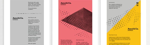
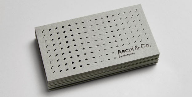
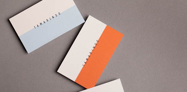
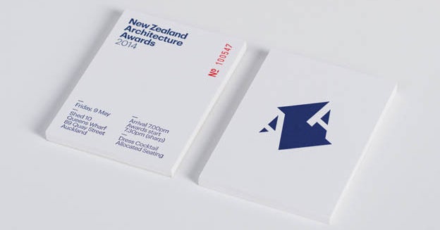
Business Card: Ascui & Co (Grosz Co.Lab)
Clients don’t like taking chances. Often times they want something that fits in with the market, which is understandable given that a gamble could cost them the business. This is perhaps why, until recently, logos have been fairly “in-the-box”; static self-contained marks, logotypes or a combination of the two.
With that said, there have always been designers willing to push the envelope and, occasionally, their revolutionary ideas see the light of day. In the example above, Melbourne based design studio Grosz Co.Lab took a completely new approach to logo design. They’ve conceptually expanded the idea of a static mark into a form with movement. Additionally, they’ve visually expanded the common proportions of a mark through repetition, giving the form flexibility to expand into any surrounding space.
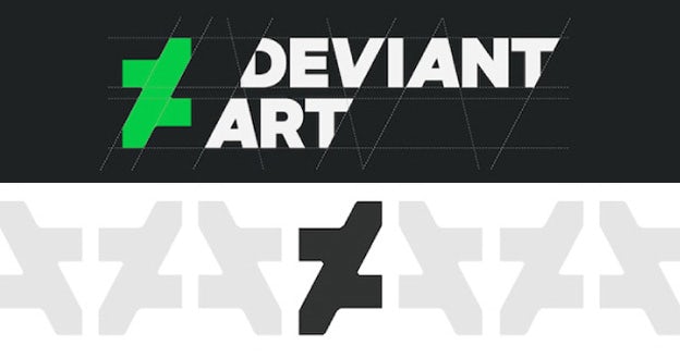
Deviant Art’s new logo (pictured above) interlocks with its own mirror image to take on the qualities of a pattern. Furthermore, the pattern’s negative space reveals up and down arrows (along with a capital “A”), perhaps in reference to the website’s focus on trending art. This may be the one of the first mainstream logos to possess pattern functionality with conceptual meaning behind it; certainly an expansion to the way a logo is defined.
As clients and designers see more and more of these revolutionary logos take hold, the qualities that define a logo will expand as well, opening the eyes of the design community to what exactly a logo can be.
2. Custom letterforms
In analog days typographers were incredibly practiced, masterful and comfortable creating beautiful letterforms. Suddenly, with the digital age came an overwhelming ocean of tools and techniques that left traditional letterform skill sets in its wake.
There’s an obvious reason that a vast amount of once hand-cut fonts are still used today, including everyone’s favorite Helvetica. These fonts are beautiful shapes grounded in fundamentals, theoretical understanding, technical proficiency and artistic inspiration.
Slowly, these classic skill sets are catching up to the digital age. Designers are becoming more and more comfortable creating custom letterforms. As a result, this coming year could see more custom letterforms than ever before.
3. Dynamic logos and logo sets
Designers and clients are always seeking ways to make logos better. After staring at the same logo for 365 days of the year every year, even the greatest design would begin to feel stale. As a way to combat that stagnation, dynamic logos came into being (think: Google’s famed daily iterations).
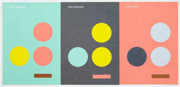
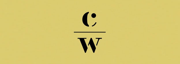
Now more than ever, logo sets are coming onto the scene to pump life and freshness into logos. In the example above, Toronto based design studio Blok turned the company name Cee into a verbal pun that opens conceptual doors for endless colorful logo iterations.
Keeping a logo fresh isn’t the only reason for logo sets. Clients, as a whole, continue to better understand their graphic design needs day by day. A biproduct of that growth is that the conceptual gap between the design of a logo and its execution throughout a brand is connected. Rather than focusing strictly on a singular, visually strong logo, designers now have to think about how that logo functions throughout a brand.
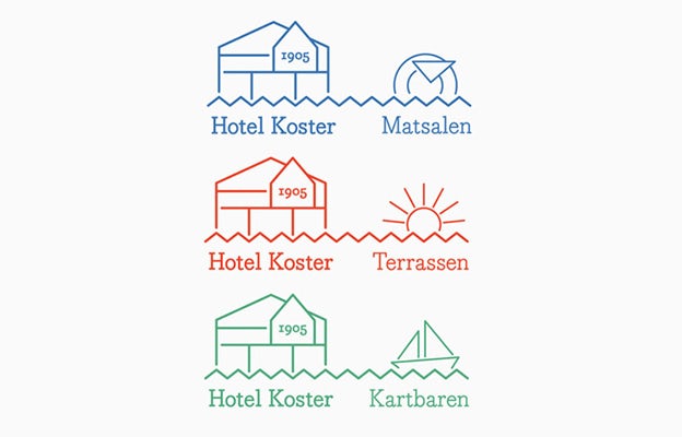
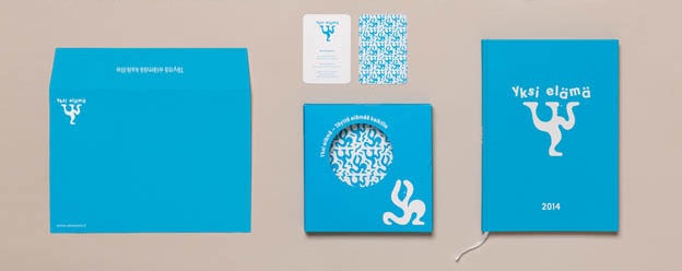
In the example above, Sweden-based design studio Bedow used a logo set for Hotel Koster to illustrate three different aspects of the Hotel.
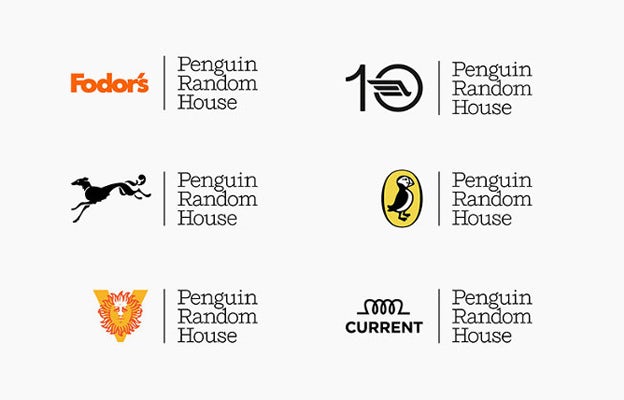
With the merging of publishing houses Penguin and Random House came yet another display of logo sets. Michael Bierut of Pentagram created a three-line logotype that accommodates any of the 250 imprints from the companies’ combined history.
While this is a unique case in a conceptual sense, it could foreshadow a wider acceptance of dynamic logos and logo sets in the near future. Lastly, for fun here video of Stephen Colbert ripping USA Today’s new dynamic logo.
Check out more examples of dynamic logos and logo sets here.
4. Simple and honest

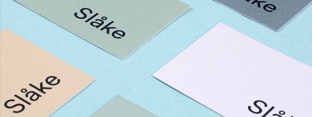
Honesty is bigger than ever. Consumers are seeking out companies with personalities they approve of and relate to. It comes as little surprise that the creative response has been down-to-earth, hand-crafted, stamped and simple logo designs.
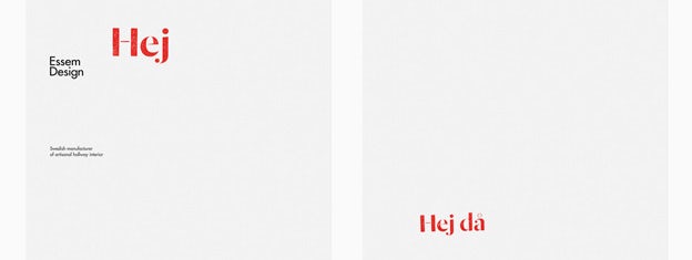
In the two Bedow designs above, analog mediums give brands a personal touch and are incorporated to make you feel like you can see eye-to-eye with each company.
5. Focus on wordmarks
Logos last an eternity and are constantly growing in number as new companies are created and old companies rebrand. The result is a storm of visual stimuli that is increasingly interfering with a consumer’s ability to connect traditional marks with their respective company.
As a result, designers may be focusing on wordmarks (or logotypes) more than ever. Wordmarks are complete, are self-contained, can improve brand recognition, and can survive on their own for years to come.
6. Lowercase is here to stay
There has always been a majority of uppercase logos. It could even be said that for some time, logos containing lower case letterforms have been perceived to be lesser than those set in uppercase. This could be due to the informal, playful nature of lowercase letterforms.
Increasingly however, designers are finding ways to make lowercase logos work in ways that are simultaneously friendly and professional. One famous example is the Walmart rebrand, where the new title case logo gives the corporation a more approachable appeal. Many other designers are joining in on the trend. Check out the examples by design studios Build and Ghost above.
7. Spot colors and understanding of print media
As the design world continues to digitize, the prerequisites for submitting designs to clients online are becoming less and less. You don’t need to know printing press mechanics, color theory or own any Pantone swatch books to submit a brand design to a client or contest online. That could be the reason why digital designers have been creating colorful gradated logos for years.
In 2015 however, as logo designers re-familiarize themselves with the printing process (out of necessity) realizations are being made. Designers will start to realize that spot colors are often visually stronger on paper and more cost effective than process colors. As a result, this coming year could be full of color solids and limited color palettes.
8. Conceptual refinement
Logo design is not the elitist medium it used to be (anyone can spot design made in a free logo maker!). The public is willing to call out logos for failing on any multitude of levels and often times, as in the case of the The Gap or the UC rebrand, the new logos get scrapped.
For this reason designers really have to start making sense, especially on conceptual levels. The following year might see the coming of conceptually simple and concise logos.
9. Stenciled and incomplete typography
What is it about stencils that has triggered a re-emergence in the logo world? Letterforms were originally cut in this way to prevent a paint stencil from falling apart. In brand production however, this is virtually never an issue.
Perhaps what remains in this mechanically unpractical use of stencil letterforms is the essence. A stencil is utilitarian, down-to-earth, for-the-people and gives a nod to printing as a craft. These qualities are ones any logo designer should have in their back pocket. It seems as though designers are now realizing that stencil letterforms are an effective medium for conjuring those qualities.
10. If it ain’t broke, don’t fix it
As a final prediction, 2015 will most certainly see more of the ongoing trends that got design to where it is now. That includes classic and more contemporary constants such as negative space, vintage-style logos, flat design and most importantly – creativity!