Judging by the developments at 99designs, this year is going to be an important one. We’re growing and improving at an ever increasing pace and we want our designers to grow with us too.
We have 12 months ahead — let’s use each month to become a better designer by learning a new skill and trying a new tip!
1. Learn to use the grid
Building a well-balanced design layout, whether for web or print, is one of the most difficult and excruciating design tasks. Grids provide an instant remedy for this problem: an organized and systematic approach to building layouts that takes away the “trial-and-error” that normally occurs.
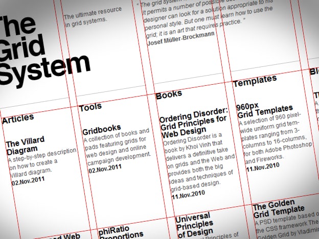
Divide your artboard into several evenly spaced columns and rows, then use them as guides for your artwork placement. To see this in action, go to www.thegridsystem.org then click on “Show Grid” button at the top right corner.
This enables you to focus on the creative part of your design work, such as concept, typography and atmosphere, while letting the grid guide your layout decisions.
Most importantly, you will never feel intimidated by your next design project because once you create a design grid, layout options become instantly visible.
Here are some great resources to get you started:
- Grids explained: http://en.wikipedia.org/wiki/Grid_(page_layout)
- 960 pixel grid system – very popular framework for web designers: http://960.gs/
- Grid system generator – http://netprotozo.com/grid/
- More resources and reading : http://www.thegridsystem.org/
2. Use technology to make better font choices
How do you normally decide on a logo font? Most likely, you set the company name in your default font, then browse through your type library until you find a good-looking option. More experienced designers will know which typefaces they want to try, so they will pick them directly.
But there are problems with both of these approaches. First, you are limiting your choices to fonts available only on your computer. Second, you are not using freely available technology which is important in our fast-moving design world.
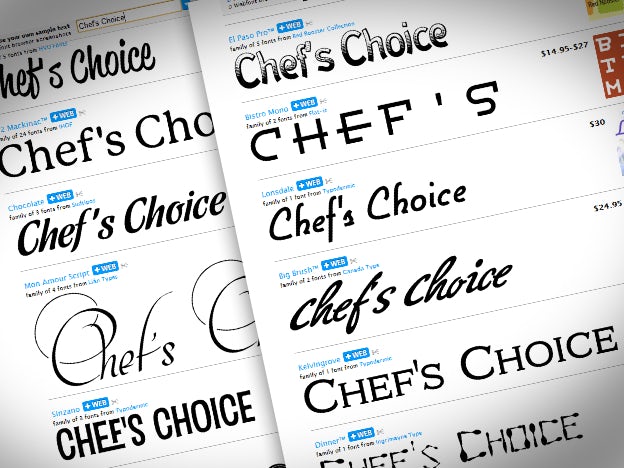
Check out the tag section from Myfonts.com.
For your next design project, head over to MyFonts.com tag section. Pick the word that best describes the style you’re looking for or use the search box in the top right corner to type a specific tag.
You will be presented with an array of typefaces that match the style you’re looking for while having the ability to type your own sample text. For example, you can pick the “restaurant” tag, type the restaurant name in the sample text box and instantly see some great fonts for your project.
3. Explore different palettes with free color generators
We are creatures of habit and most of us pick the same color combinations over and over. Believe it or not, these choices are often influenced by your software defaults – notice that most vector designs use default color swatches from Adobe Illustrator.
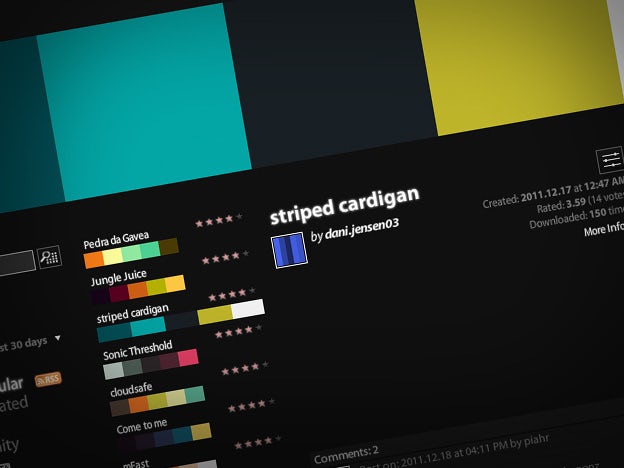
Adobe Kuler lets you explore and share great looking color combinations.
The simplest way to break this habit is to use online color generators, such as Adobe Kuler. This tool will let you browse through thousands of great looking color combinations, then save them in an ASE format which can be easily imported into any Adobe application (note: you need to register to be able to save but it’s free).
Another good trick is to generate your palette from an image or photo, which is immensely helpful when your brief includes mandatory images or photos, or when you simply like the colors in an image. Try Color palette generator from cssdrive.com, which will build CSS and Photoshop palettes straight from your images.
4. Design to tell a story
Great design is less about decoration and more about communication. What makes a designer famous is not the ability to create nice looking work – it’s the ability to send a message and get a point across effectively.
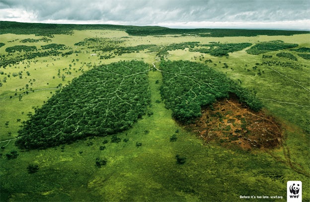
Environmental issues are often hard to explain, but this WWF ad is a classic example of good storytelling (via Ads of the World)
The best way to learn this skill is to study advertising techniques. Advertising can teach you about analogies, metaphors and other creative tools that will help you create convincing and persuasive designs.
If you’d like some examples, check out this post from Alex Bigman or explore these how-to articles from AdCracker.com
5. Use pen and paper while brainstorming
Starting your design project inside Photoshop or Illustrator can be a serious handicap for a number of reasons but most notably… loss of creativity.
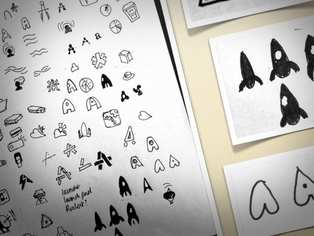
Jon Hicks, a notable icon designer behind MailChimp, Shopify and new Skype emoticons, always starts with pencil sketches.
Design programs weren’t made to explore design ideas and options, but to execute them once they’re already set. When you use them during the idea stage, you’re actually working incredibly slow – you need to worry about clicks, points, buttons, weights and swatches… none of which is required by your pen.
Also, you might be tempted to play with colors and effects which will only drive your attention away from the idea itself.
6. Never settle for one idea
I have a question – how do you know what’s good, until you’ve seen what’s bad? The answer is that you don’t, yet many designers make the simple mistake of settling with the first idea that comes to mind.
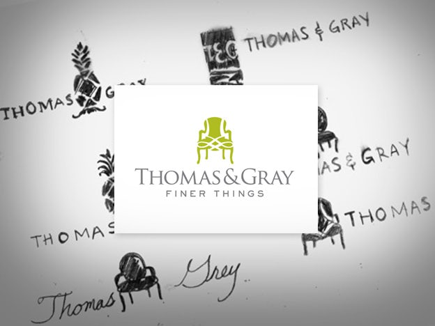
Mario Ocon developed 6 different ideas for Thomas & Gray before deciding on the final idea.
Always develop at least three, completely different, design ideas for your project… no matter how overwhelming this might seem. This will not only get the generic stuff out first but will give you something to compare and separate the good from the bad.
7. Use RIS approach to drive your design decisions
This is an acronym for Response – Imagery – Solution, which is a 3-step system for coming up with highly effective designs. This method works best for more complex design pieces such as brochures, websites and posters but it can be used for logo inspiration too.
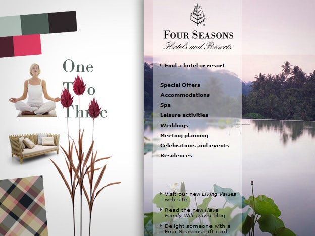
To elicit feelings of relaxation and luxury, Four Seasons uses imagery, colors, patterns and fonts which trigger such emotions.
You need to split your work into three distinct stages:
- Response – which emotions and impressions do you want to elicit with your design? For example, if you’re doing a website for a popular ski resort, you might want to elicit emotions of joy and excitement while making people think the resort is upscale and prestigious.
- Imagery – which images and visual elements can be used to stimulate such responses? Think in terms of colors, textures, photography, patterns and fonts. For our ski resort example, joy and excitement could be provoked with images of people skiing and having fun, while prestigious element can be introduced with big serif headlines, silvery-black palette, and perhaps slightly textured background. For this stage, it’s best to develop a mood board, but it’s not absolutely necessary.
- Solution – develop the design concept based on your imagery and check to see if it makes people feel the way you intended them to.
8. Make a cover version of a popular design
Copying and imitation is generally bad for most purposes but it’s an excellent learning tool for beginners. Just as many musicians practice their skills by singing cover versions of popular songs, you can create cover versions of popular designs.
The task is simple – find a website, poster or logo design you really like, then try to reproduce it as well as you can. You can either make an identical replica, or change it to reflect your personal style.
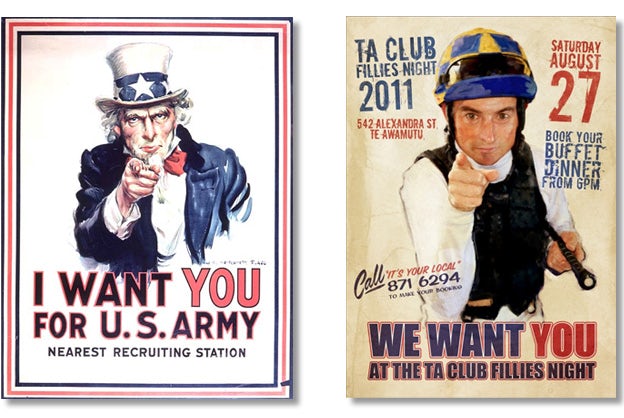
Because of it’s popularity, the poster for the US army has been reproduced in numerous cover versions, most of them funny in their appearance.
Covering a design will make you even more appreciative of the original work, and best of all, you will expand your creative and technical skills.
You will understand how the layout was constructed (and why), which combination of fonts were used, how the particular texturing was created and which technical challenges the designer faced in order to get the details right.
Note: this exercise is just for learning. Do not copy other designs and submit it to a contest or to a real client.
9. Decorate your office – intelligently
Designers need inspiration and white walls will not give you much inspiration. However, instead of building a generic “creative” office which looks good but serves no purpose, why not decorate with practical items?
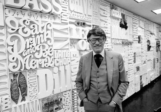
Lou Dorfsman, a graphic designer who took care of CBS identity for over 40 years, created a famous work titled Gastrotypographicalassemblage — a 35 feet wide work of art decorating the CBS caféteria.
For example, you could:
- Print out your font library and hang it on a wall.
- Create 20 color combinations you like and paint them on your ceiling.
- Print out and frame common website or brochure layouts.
- Buy a flipchart and use it to sketch ideas while standing.
This will create a stimulating environment which will get your juices flowing while providing you with references to typefaces, colors and other important elements.
10. Research more
When you don’t know a lot about the subject of your design, you are missing out on many ideas and opportunities.
For example, a recent contest I participated in asked for a 1920’s-inspired design for a cocktail bar. I explored different type options from that time period. Interestingly, I discovered a well-known building in the client’s city which contains reliefs and typography from the same era. I decided to use the same typefaces in my design.
This definitely caught the client’s attention and gave a whole new perspective to my design proposal — all it took was some Google work.
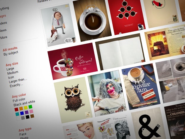
Working on a coffee project? Go to Google images, type “coffee ad” and see how coffee clients think.
Here are suggestions on what to search when exploring your design subject:
- History & place of origin – for example, if you’re designing a logo for a “Cocoa place,” search for “Cocoa history” or “Cocoa stories” and see if you can find something interesting
- Industry advertising – go to Google images, then search for “X ad,” X being your subject matter. You will see examples of your client’s industry advertising, which will give you some great insights into their design language
- Localities – if your client’s product is localized or made for specific geographic market, explore that location
- Facts and figures – type into Google what you’re interested in, followed by the word “facts.” You will narrow down your results to easily digestible blog posts and articles, perfect for quick introductions to less familiar subjects
11. Learn to draw
Knowing how to draw will make you twice as good and valuable because there are certain design problems that are best solved with this basic artistic skill.
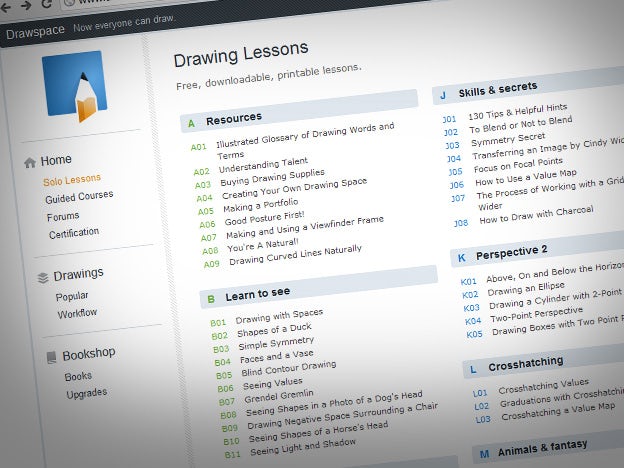
Drawspace offers 200 free, printable drawing lessons. You can even enroll in a paid course and get teacher guidance.
When you don’t know how to draw, you will keep inventing less than perfect workarounds for things which essentially require a drawing or illustration skill, such as icons and character logos. Plus, you will miss the innate sense of visual balance and harmony that develops naturally with this skill.
Today, learning to draw is easier than ever — just google “learn to draw” or go directly to drawspace.com.
12. Learn to (copy)write
Designers often overlook the importance of writing skills in their work, yet messages and communication are the reason graphic design exists in the first place.
Some design pieces can be based purely on good copywriting.
Though copywriters are usually asked to handle the writing part of the project, understanding basic principles of good writing is a mandatory skill of every professional graphic designer.
Start small – pay more attention to your writing style in emails, then go from there. For those of you eager to improve quickly, checkout Copywriting 101, a free guide from Copyblogger.